The Official Logo of the Synodal Path

The Official Logo of the Synodal Path

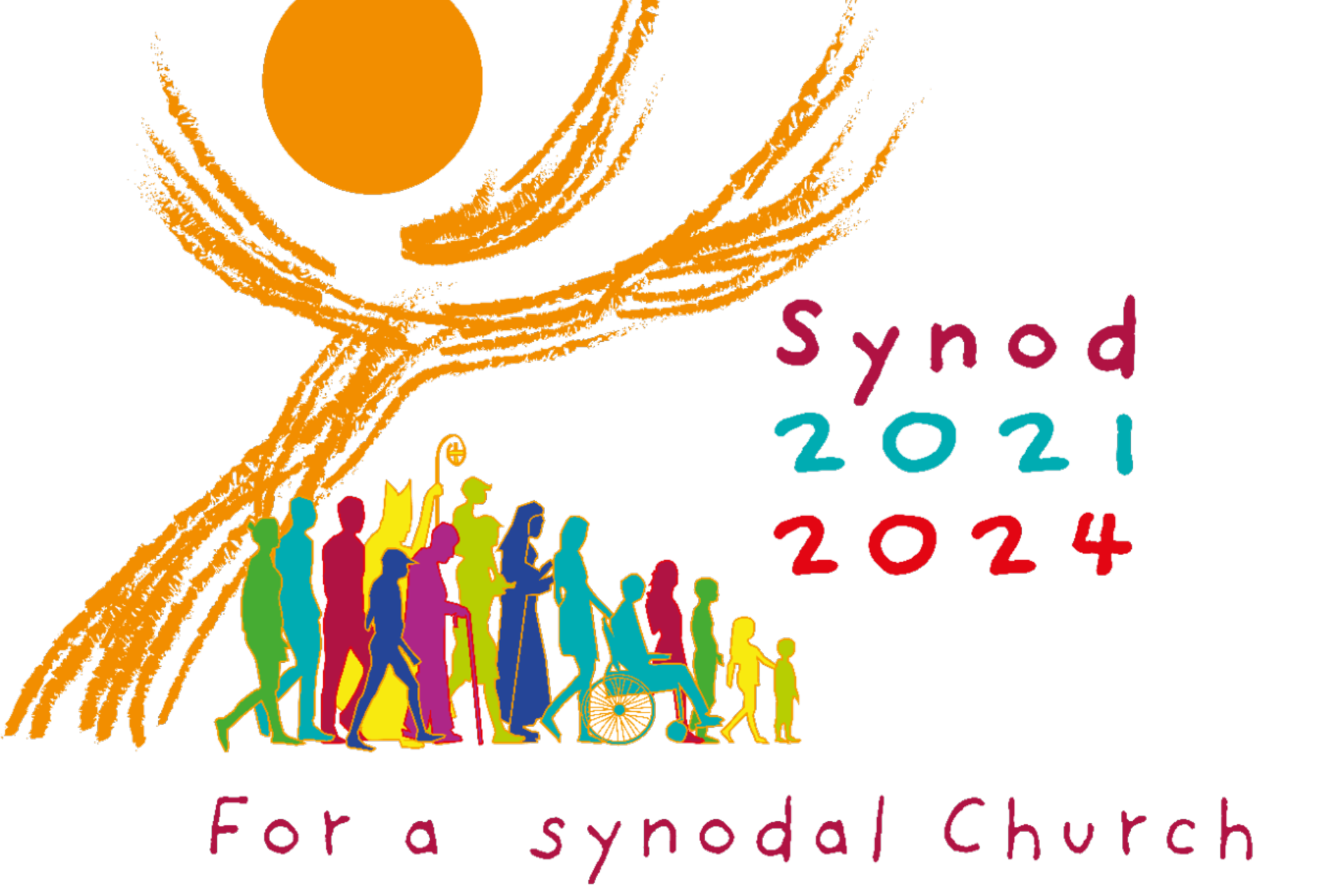
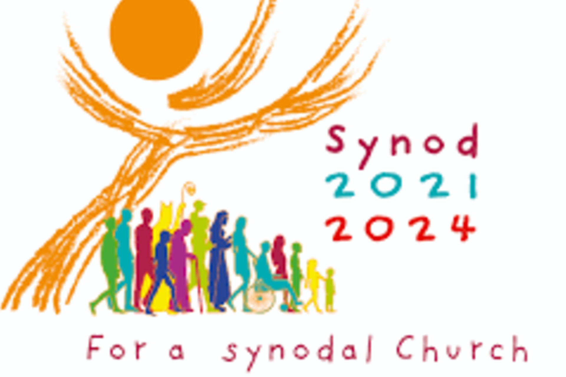
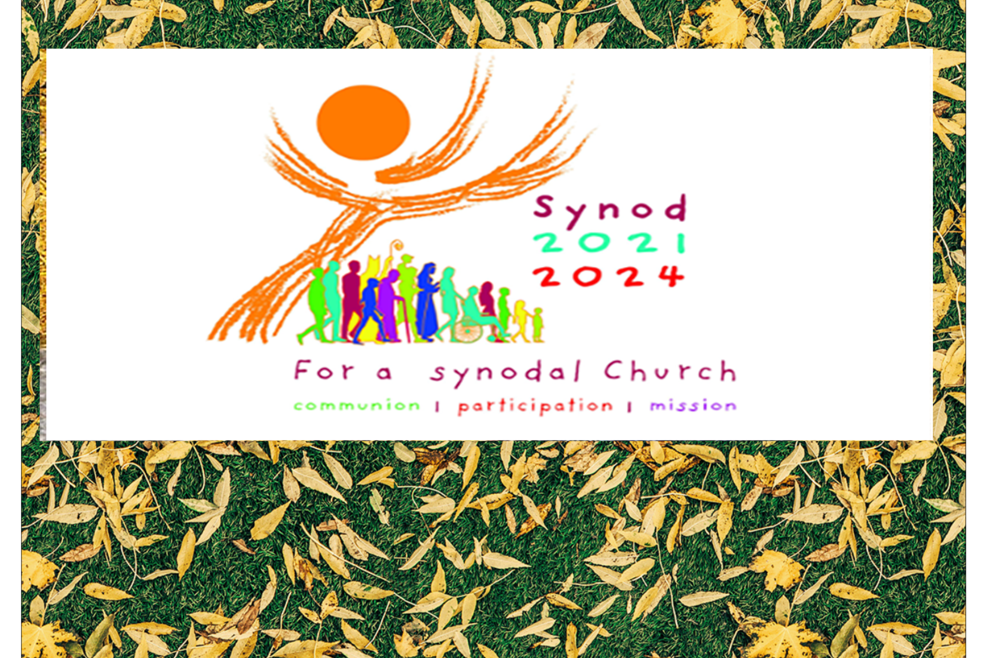
A large, majestic tree, full of wisdom and light, reaches for the sky. A sign of deep vitality and hope which expresses the cross of Christ. It carries the Eucharist, which shines like the sun. The horizontal branches, opened like hands or wings, suggest, at the same time, the Holy Spirit.


The people of God are not static: they are on the move, in direct reference to the etymology of the word synod, which means "walking together". The people are united by the same common dynamic that this Tree of Life breathes into them, from which they begin their walk.

These 15 silhouettes sum up our entire humanity in its diversity of life situations of generations and origins. This aspect is reinforced by the multiplicity of bright colours which are themselves signs of joy. There is no hierarchy between these people who are all on the same footing: young, old, men, women, teenagers, children, lay people, religious, parents, couples, singles; the bishop and the nun are not in front of them, but among them. Quite naturally, children and then adolescents open their walk, in reference to these words of Jesus in the Gospel: " I praise you, Father, Lord of heaven and earth, because you have hidden these things from the wise and learned and revealed them to little children”. (Mt 11:25)

The horizontal baseline: "For a synodal Church: communion, participation and mission” runs from left to right in the direction of this march, underlining and strengthening it, to end with the title "Synod 2021 - 2023", the high point that synthesizes the whole.